Deciphering Stock Charts: Understanding Red and Green Candles
Candlestick charts are a powerful tool for analyzing stock price movements, providing valuable insights into market sentiment and trends. In this article, we delve into the names and characteristics of each red and green candle, unraveling the language of candlestick chart analysis.

Understanding Candlestick Charts:
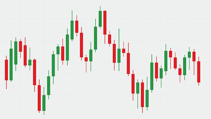
Candlestick charts visually represent price movements over a specific time period. Each candlestick comprises a body and wicks (or shadows) at both ends, reflecting the high and low prices during that period. The color of the candle—either red or green—indicates the price action and market sentiment.
Green Candle: Bullish Movement
1. Long Green Candle:
Characteristics: A long green candle indicates a strong bullish movement, where the closing price is significantly higher than the opening price. The longer the body, the more substantial the price increase during the time period.
2. Doji Green Candle:
Characteristics: A doji green candle has a small body, suggesting indecision between buyers and sellers. It often appears after a strong upward trend, signaling potential exhaustion and a shift in momentum.
3. Spinning Top Green Candle:
Characteristics: The spinning top has a small body with both upper and lower wicks, indicating indecision in the market. It reflects a balance between buyers and sellers and can precede a reversal or continuation of the trend.
Red Candle: Bearish Movement
1. Long Red Candle:
Characteristics: A long red candle signifies a strong bearish movement, where the closing price is significantly lower than the opening price. The longer the body, the more significant the price decrease during the time period.
2. Doji Red Candle:
Characteristics: Similar to its green counterpart, a doji red candle has a small body, signaling uncertainty and potential indecision in the market. It often appears after a strong downward trend.
3. Spinning Top Red Candle:
Characteristics: The spinning top with a red body indicates a market in which neither bulls nor bears have a clear advantage. It reflects a potential reversal or continuation of the downtrend.
Key Takeaways:
1. Color Symbolism:
Description: Green candles symbolize bullish movements, where buyers are in control, pushing prices higher. Red candles represent bearish movements, indicating that sellers dominate, leading to lower prices.
2. Body Size Matters:
Description: The size of the candle body provides insights into the strength of the price movement. Larger bodies suggest more significant price changes, while smaller bodies may indicate indecision or a slowing trend.
3. Wicks and Shadows:
Description: The length of the wicks or shadows reveals the price range during the time period. Long upper wicks suggest selling pressure, while long lower wicks indicate buying interest.
4. Candle Patterns:
Description: Analyzing consecutive candles and patterns, such as engulfing patterns or harami, can offer additional insights into potential trend reversals or continuations.
Conclusion:
Candlestick charts are a visual language for traders and investors, providing a nuanced understanding of market dynamics. By interpreting the names and characteristics of each red and green candle, practitioners can gain valuable insights into market sentiment, aiding in decision-making and technical analysis.
